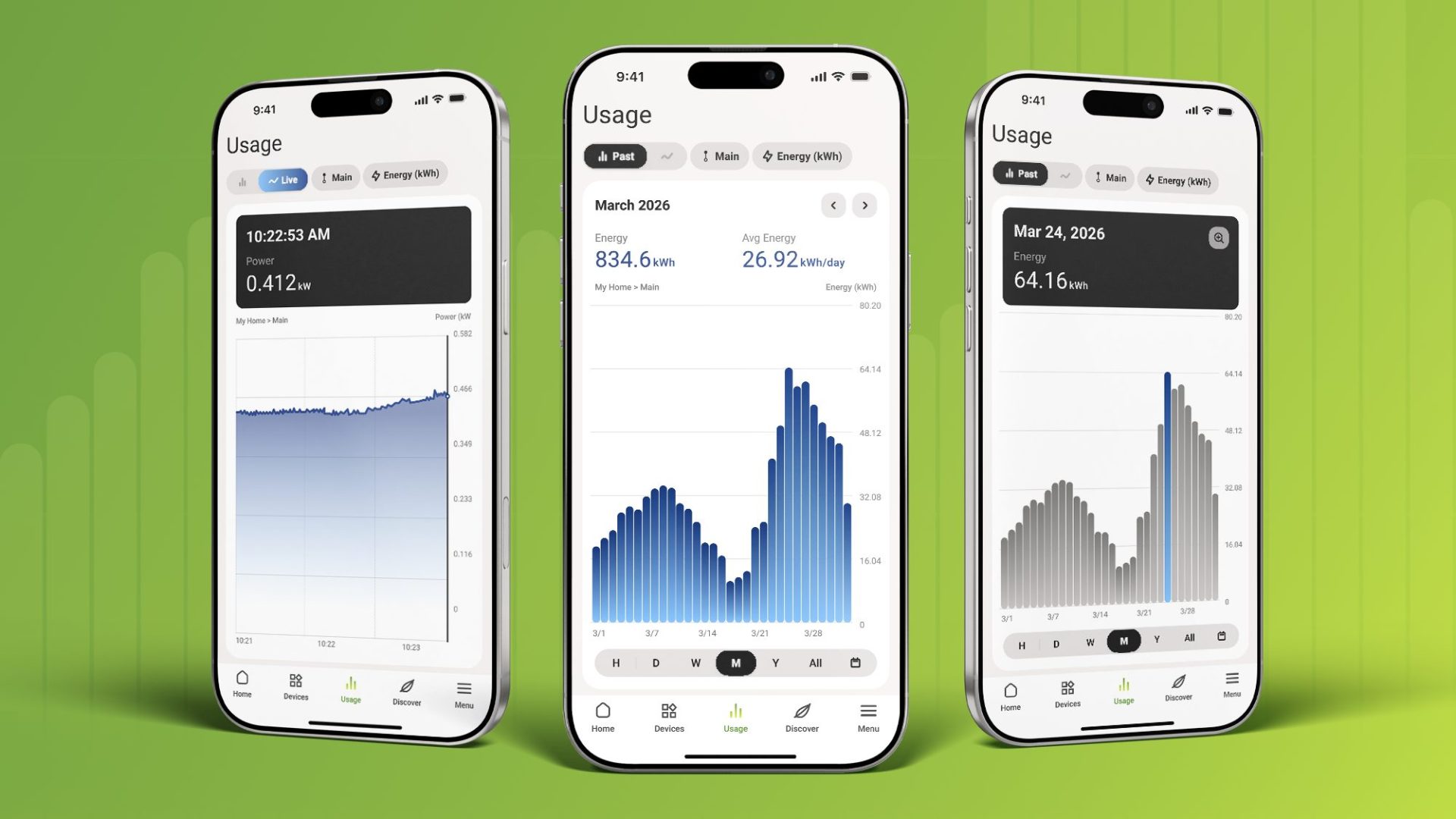
The usage charts in the Emporia app just got a major upgrade. You can now filter your data in one tap, drill down from yearly totals all the way to individual minutes, and jump to any date you want with a custom date picker. Whether you’re checking last night’s EV charging session or investigating a spike from three weeks ago, the data is easier to find and easier to read.
Here’s what changed and why it matters.
Filter Your Data in One Tap
New filter chips at the top of the usage screen let you switch between live and past mode, change the time window, and toggle between kW and kWh, all without leaving the chart. The app automatically shows the right unit for the view you’re in (watts for live data, kilowatt-hours for historical totals), so you always know whether you’re looking at a rate or a total.
It’s a small change that makes a big difference in how quickly you can find what you’re looking for.
Drill Down from Year to Minute
Tap any bar on a chart to see a tooltip with the exact value for that period. On line charts, tap and hold for the same detail. When more granular data is available, a magnifying glass icon appears. Tap it, and the chart zooms in one level deeper.
The drill-down goes all the way from Year to Minute, one level at a time. Start with a monthly overview, tap a week that looks unusual, drill into a specific day, and keep going until you’re looking at 15-minute intervals or individual minutes.
For EV charger customers, this means you can finally see the shape of a charging session: the ramp-up when your car starts pulling power, the plateau at full charge rate, and the taper as the battery fills. That’s the kind of detail that was missing before.
For Vue and smart plug customers, drill-down makes it straightforward to investigate unusual usage. See a spike on Tuesday? Tap it, drill down to the hour, and figure out what was running.
Jump to Any Date with Custom Date Selection
Previously, you were limited to fixed time windows: this week, this month, this year. If you wanted to pull up a specific date from three weeks ago, you had to scroll through the chart to get there.
Now there’s a date picker. Tap it, select any date and time, and the chart loads that view directly. The chart’s resolution adapts to the range you’ve selected. A narrow window shows granular 15-minute detail, while a wider window shows broader totals.
This is especially useful for troubleshooting. If your utility bill looks higher than expected, you can jump straight to the dates in question and see what was happening, circuit by circuit.
Better Charts for Every Customer
These improvements were designed to make the usage charts genuinely useful for every Emporia customer. If you own an EV charger, you can now see session-level detail that wasn’t possible before. If you own a Vue, navigating your whole-home data is faster and more intuitive. And if you’re using multiple Emporia products, the same charts tie everything together in one place.
The update is available now in the latest version of the Emporia app. If your app hasn’t updated automatically, check for updates in the App Store or Google Play.
Your home energy, all in one place.
Monitor usage, control your devices, and track costs from anywhere in the free Emporia app.